|
Getting your Trinity Audio player ready...
|
Perkins, a beloved heritage brand that has been a cornerstone of American dining for decades, has recently undergone a rebranding that not only embraces its rich history but also taps into the growing cultural trend of nostalgia. This rebranding effort is nothing short of genius, as it artfully connects with long-time customers while appealing to a new generation looking for that elusive “third place”—a comfortable and familiar space outside of home and work where people can gather, relax, and connect.
The Power of Nostalgia in Modern Branding
Nostalgia is a powerful tool in branding, particularly in an era where consumers are increasingly seeking comfort and familiarity in a fast-paced, digitally-connected world. For many, brands like Perkins evoke cherished memories—whether it’s late-night dining with friends, family breakfasts after church, or simply the comfort of a warm meal in a welcoming environment. These memories are not just about the food, but about the emotions and connections that were fostered within Perkins’ walls.
In rebranding, Perkins has wisely leaned into this deep well of nostalgia. By refreshing its visual identity and brand messaging while staying true to its heritage, Perkins has successfully reinvigorated its image without alienating its loyal customer base. The rebranding effort acknowledges the past while looking forward, creating a bridge between generations.


Why Perkins’ Recent Rebranding is a Masterstroke of Nostalgic Genius
Perkins, a beloved heritage brand that has been a cornerstone of American dining for decades, has recently undergone a rebranding that not only embraces its rich history but also taps into the growing cultural trend of nostalgia. This rebranding effort is nothing short of genius, as it artfully connects with long-time customers while appealing to a new generation looking for that elusive “third place”—a comfortable and familiar space outside of home and work where people can gather, relax, and connect.
A Personal Connection: The Story of the Perkins Carpet
Everyone who has visited Perkins likely has a story to share. For me, the most memorable experience wasn’t a meal, but rather a quirky connection that I’ll never forget. In college, one of my close friends had a piece of Perkins history in his dorm room—a section of the iconic carpet from the Stillwater, MN location, owned by his father. When the restaurant was remodeled, the old carpet was replaced, and my friend was given a piece of it to keep. The carpet was wild—think Casino flooring on methamphetamines. It was bold, colorful, and practically indestructible. You could spill a drink or commit a crime on it, and no one would ever know. That carpet was a conversation starter, a piece of nostalgia that brought the comforting chaos of a Perkins restaurant into our dorm room.
This story, like many others, highlights the unique place Perkins holds in the hearts of its customers. It’s not just a restaurant; it’s a cultural touchstone, a place where memories are made and shared.
Why the Rebranding is Brilliant
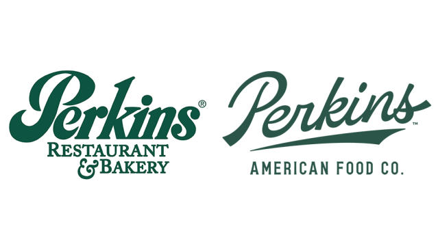
The Perkins rebranding was executed with precision and an acute understanding of its brand equity. The rebranding initiative, led by Perkins’ new president, Toni Ronayne, is a response to extensive research revealing that customers crave “The American classics of yesterday in a place that feels like today.” This insight led to the brand’s transformation from Perkins Restaurant & Bakery to Perkins American Food Company, a shift that not only modernizes the brand but also deepens its connection to its roots.
Ronayne’s vision for Perkins is clear: to honor its legacy while evolving to meet the needs of contemporary consumers. She noted, “Our essence is modern American hospitality, and we will continue to innovate at every step to drive guest count, elevate our brand, and grow net new unit growth.” This rebranding effort, developed in collaboration with the brand agencies Dunn & Co. and Aria Group, includes a comprehensive overhaul of Perkins’ visual identity, menu, and restaurant design.
The new logo and updated color palette harken back to the classic Perkins design but with a modern twist, creating a brand identity that feels both nostalgic and current. The restaurant redesign and refreshed look are intended to create an environment that appeals to today’s customers while maintaining the warm, welcoming atmosphere that has always defined Perkins.
Connecting the Brand to the “Third Place” Concept
One of the most significant aspects of Perkins’ rebranding is its alignment with the “third place” concept—a term coined by sociologist Ray Oldenburg to describe spaces outside of home and work where people can gather, relax, and connect. In today’s digital age, where many of our interactions happen online, the value of a physical third place is more important than ever.
Perkins has always been a third place for many—whether it’s a late-night stop after an event, a weekend breakfast spot, or a place to meet friends and family. The rebranding reinforces this role by emphasizing the comfort, familiarity, and welcoming atmosphere that have always been part of the Perkins experience. The updated branding invites people back to rediscover Perkins as their third place, a sanctuary where they can escape the hustle and bustle of daily life and reconnect with what matters most.
The Role of Heritage in Modern Branding
Heritage brands like Perkins have a unique advantage in the marketplace—they come with a built-in legacy that newer brands simply can’t replicate. The challenge, however, is to remain relevant in a changing world. Perkins’ rebranding is a masterclass in how to do just that. By respecting its heritage while updating its image, Perkins has successfully navigated the delicate balance between past and present.
The brand’s messaging now reflects a deeper understanding of its customers’ emotional connection to the Perkins experience. As Ronayne explained, “We are constantly evolving to create new foods and experiences that are relevant to today’s customers.” This approach ensures that Perkins stays true to its roots while remaining a vibrant, relevant option in today’s dining landscape.
The Vision for the Future
As Perkins moves forward, the rebranding effort is expected to play a crucial role in its growth strategy. With plans to roll out the new branding across corporate and franchised locations, and a focus on expanding into new markets with smaller, more efficient restaurant models, Perkins is positioning itself for a strong comeback.
Ronayne is optimistic about the future, highlighting the company’s momentum in service and operational excellence, and pointing to new initiatives like an updated menu and a soon-to-launch loyalty program as key drivers of growth. “We are looking forward to reintroducing ourselves to our guests and showcasing that we have accessible and affordable options, elevated and innovative American classics, and staff who go above and beyond,” she said.
As Perkins embarks on this exciting new chapter, we’d love to hear what you think about the rebranding effort. Whether you have fond memories of past visits or are eager to see the new Perkins American Food Company in action, your thoughts and experiences are valuable to us. How do you feel about the blend of nostalgia and modernity in this rebrand? Are you excited to visit and experience the updated menu, refreshed interiors, and new dining concepts firsthand? Join the conversation, share your stories, and let’s celebrate the future of Perkins together. We look forward to hearing from you and seeing you at Perkins soon!


